The complete article can be found here.
The bar code charts look like this:
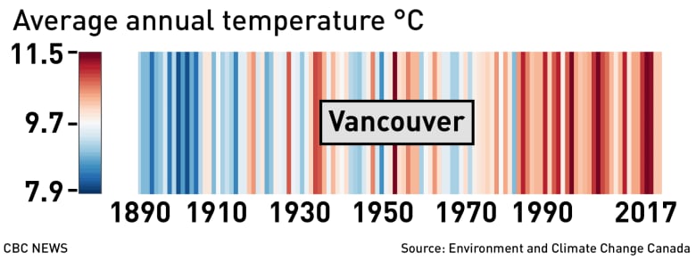
Each bar represents the average temperature for one year.

Of interest are bar code graphs for more northern locations. Average temperatures in those locations have been increasing more rapidly than further south.